Nina Barnieh-Blair Upgrades A Cozy New York Apartment
Photographs by David Land
The job of an interior designer is one of constant reinterpretation. Rarely does a designer work from their own tastes, preferences or cultural background alone, but blends them with those of the client to create a space that best suits their tastes and preferences while meeting their needs. For the last 12 years, New York interior designer Nina Barnieh-Blair has become an unquestioned expert in the art and process of collaboration with her clients. Blair brings to each client a full background of design influences starting with her native Ghana, through her British upbringing and design education at Parsons. So when her client, a clinical psychologist in Manhattan’s West Village, wanted to turn her 522-square-foot pre-war apartment into an “urban treehouse,” she found herself in incredibly good hands.
The apartment, which the client has lived in since 2004, was in a condition that Barnieh-Blair referred to simply as, “faded.” Bringing it into its new life would require a complete renovation. Even opening the walls to rearrange the the aging pipes. “The easiest part of the process,” the designer relates, “was collaborating with client to arrive at our governing concept.” From there it got complicated. “We had to move pretty much all the plumbing and fixtures, which in a pre-war building, where you never quite know how anything works until you open it up, is always an interesting process.”
With only 522-square-feet to work with, it was imperative that Barnieh-Blair not only make every square inch count, but that every square inch work together harmoniously to create a feeling that was bigger than the interior space. A firm believer that all great rooms begin with art, Nina worked with her client on her first art purchase for the space, Monika. Warsa by photographer Alec Soth. The colors of the work set the palette for the room, a colorful yet serene arrangement championed by the inviting pink sofa from Ligne Roset.
Furniture in the living room was kept intentionally sparse by the designer, both to create the feeling of serene minimalism that permeates and opens the space, and to accommodate her client’s active yoga practice. But when every piece in a room makes a statement, you really don’t need that much. Further emphasizing this point is the gorgeous Peca's Rima Credenza from 1stDibs. Coupled with the eye-catching woven art piece, Hiroko Takeda’s Yellowbird IV, it’s a combination that skillfully adds color, texture and pattern to the space, while deepening its relaxed and meditative feel.
Though there were areas that required more work and attention, overall the living room stands out as one of the designers favorite spaces in the project. “I love the living space,” she confesses. “I was really happy about how a small room that has to function as living space, entertaining space and working space, ended up working perfectly for each, and felt much bigger than its dimensions. Every single piece we selected was chosen with this multi-functionality in mind.”
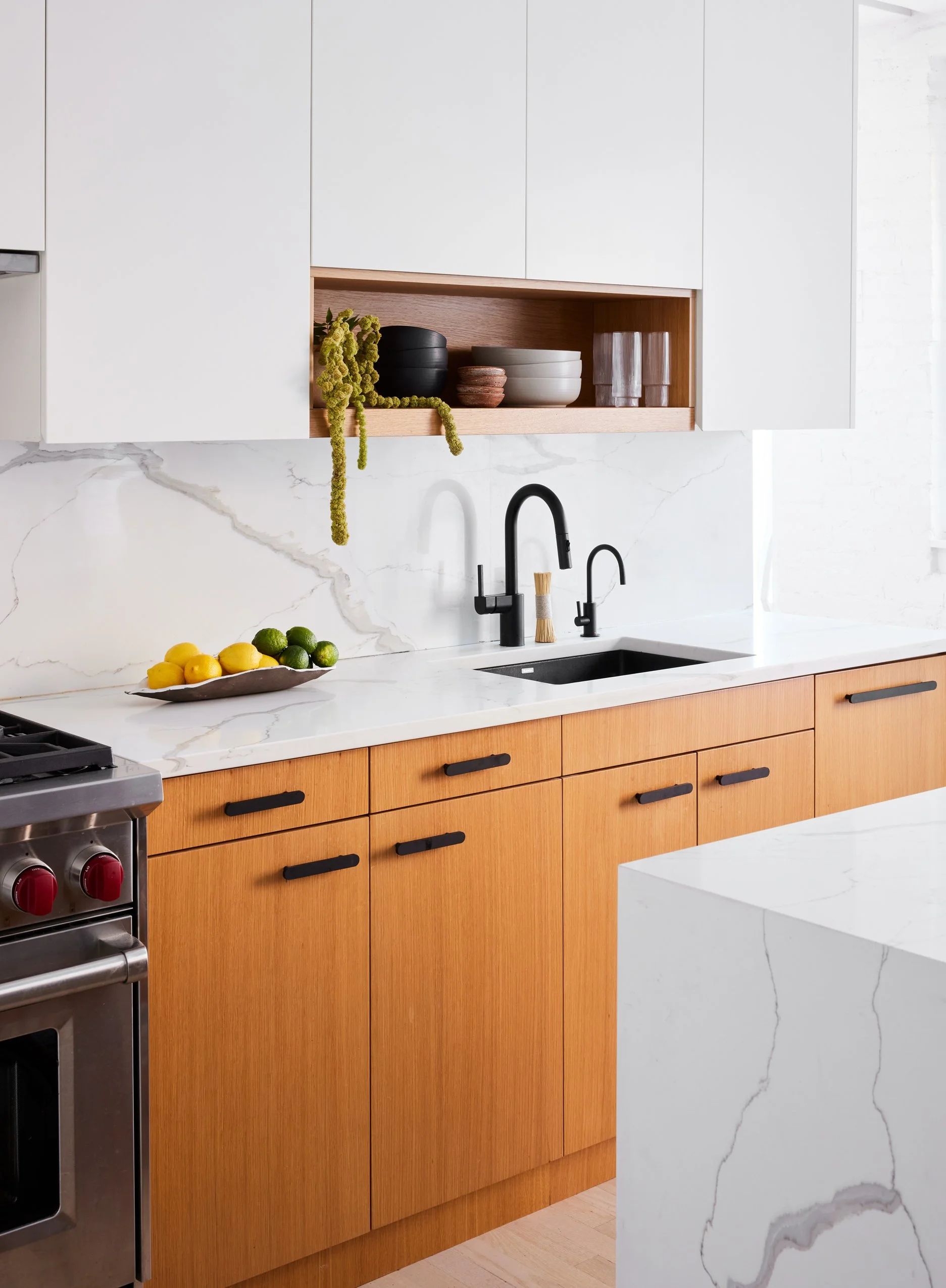
Yet while the living room may be Nina’s favorite, the kitchen might stand out as the crowning achievement of this home. At its center stands a beautifully created kitchen island. Despite the kitchen’s reputation for being the most labor-intensive part of many renovations, this space continues the feeling of effortlessness that moves throughout this home, owed largely to its judicious use of white oak. Keeping with the theme of multi-functionality in small spaces, the island serves as a workspace as well as a dining area, and even includes hidden refrigerated drawers for food storage. The island is adorned from above by copper-finished pendants and accompanied by upholstered stools, both from Danish design brand and manufacturer, Gubi.
On the other side of the island, Nina skillfully blended the functional needs of a kitchen with the established aesthetics of the home within the limited space allowed. The red knobs of the oven offer a bit of color in the space, contrasting the matte black faucet and drawer pulls. The drawers and cabinetry of the room seem to fade into the walls, highlighted by the marble backsplash, another subtle hint of color and pattern that keeps the space interesting despite its adherence to a minimalist perspective.
In a home committed to tranquility, it’s no surprise that the bedroom would be a point of emphasis. Maintaining the white walls that cover the rest of the home, this room contrasts them with strong, colorful bedding and geometric patterns through a vintage Kente cloth from Sunday Shop. The space is further defined by the Kalon Simple Bed in Ash, its natural materials further contributing to the serene and calm feel of the space. “Custom narrow floating bedside tables in white oak finishes complement the limited color palette and maximize space in the cozy bedroom,” Nina adds.
Great design means considering small details. In this home, that means not ignoring the hallway that connects the bedroom to the other side of the apartment, and the bathroom that lies on the far side of the kitchen. Running along the backside of the home, it would be easy to overlook. But Barnieh-Blair designed the route to be aesthetically consistent with every other space. “The hallway connects public and private spaces,” the designer reflects on, “framing the bedroom, kitchen, and bathroom doors in white oak finishes, and creating a harmonious transition between areas.” The expanse between areas is as useful as it is attractive. With hidden storage built-in to maximize functionality, it includes space for cleaning supplies and a washer-dryer. To maintain the overall aesthetic and theme of the apartment, Nina punctuated the space with the Orion Mirror in brass and mirrored glass, partnered with the Windows Of Bo Bardi Side Table from Destroyers/Builders.
“Consistency is the key to creating a sense of harmony and cohesion throughout a residence,” Barnieh-Blair offers. Case in point, the bathroom in this apartment carefully adheres to what the designer calls the, “limited material and color palette established in the rest of the apartment.” The familiar and welcome presence of white oak reappears in the vanity, which, like so many other elements in the home, seamlessly blends with clever storage solutions built into the construction, echoing the emphasis on marrying practicality and style.
“The bathroom is one of the most personal spaces in any home, and especially in this one where the decor is inspired directly from the client’s own travels to Italy and Greece. We selected tiles reminiscent of the Amalfi Coast, featuring a rich spectrum of blue-green hues and distinctive crackled detailing to capture the essence of Mediterranean seascapes,” Nina says. “Arranged in a chevron pattern, these tiles add visual interest and texture to the space. From my client’s point of view,” Nina reflects, “home needs to be a tranquil refuge where she can recharge the energy that she gives so much of to the people she works with. I’m happy to say that this design achieved that on multiple levels.”


